Admin Insights
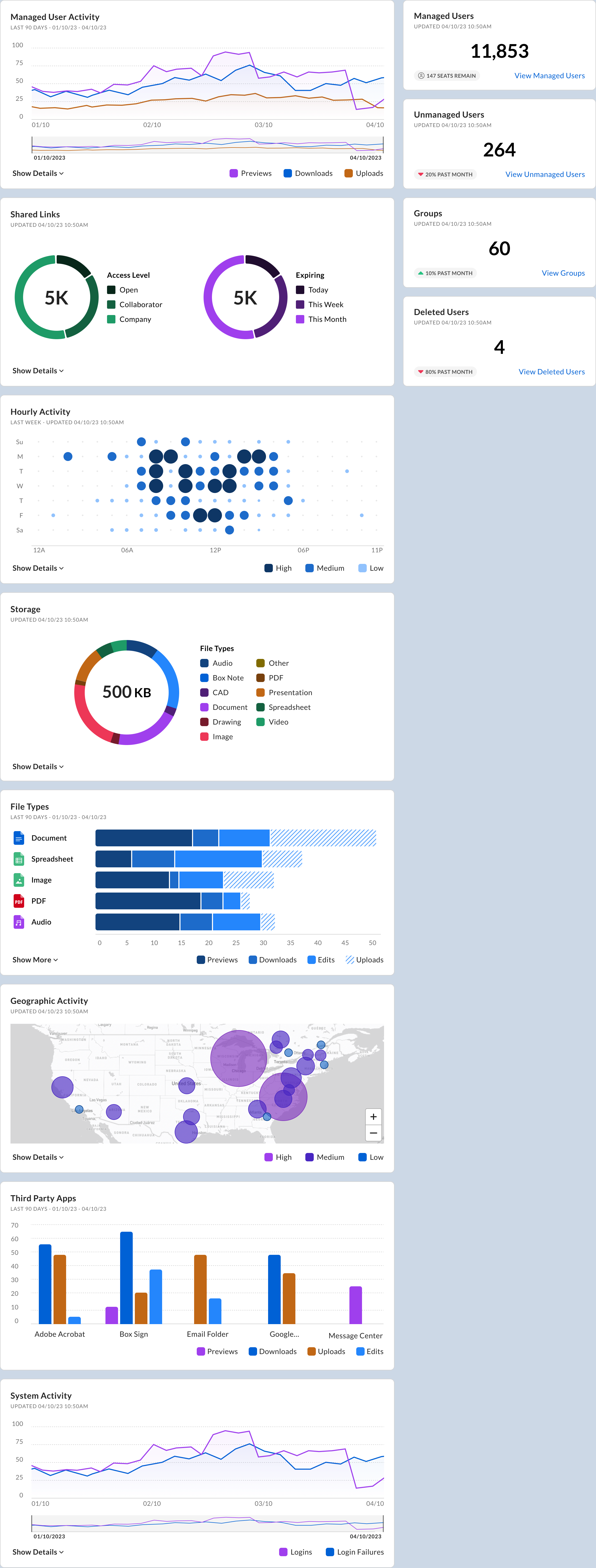
Insights is an administrator dashboard that provides a comprehensive view of your organization’s Box usage, storage, and deployment statistics. The data tiles in the dashboard give you a quick visual snapshot of recent user activity, storage, and other helpful statistics. These charts and graphs in the tiles include:
- Users
- Total storage
- Groups
- User activity
- Most used third-party applications
- Geographic activity
- Hourly activity
See Admin Insights Data Tiles for details about each of the data tiles.
You must be an administrator or a Co-admin with the Run new reports and access existing reports permission enabled to view the Insights page.
The information in the dashboard gives you a fast, simple way to understand how your people are using Box, which should help you more efficiently manage Box usage in your organization. For example:
- See where Box is accessed globally, so you can deal with unauthorized logins and ensure regional deployments are active
- See which Box integrations are being used, so you know which tools are being adopted for which business processes.
Other questions you can quickly answer include:
- What is the trend of my user activities?
- Is usage growing?
- From which locations are people accessing Box?
- How much storage is being used?
- What are the most popular third-party applications?

Configuring the Insights Dashboard
You can configure the layout of your Insights dashboard and which tiles appear in it. (Tiles with charts and graphs can also be configured individually. See Admin Insights Data Tiles for details.)
- Go to Admin Console > Insights.
-
Click Settings (
 ).
).
-
Configure the dashboard the way you want it:
- In the Layout section, select either Default (default), which is graphical charts in the left column and numerical cards in the right column, or Reversed columns, which is numerical cards in the left column and graphical charts in the right column.
- In the Charts and Cards sections, select which tiles you want to appear in the dashboard. At least one of each must be selected.
- Click Save.
Hover your mouse pointed over a tile, and then click and hold
 to move the tile up or down in its column.
Customizing a Graph
You can customize the data that is shown in the graphs and detail lists on the tiles.
To customize the data shown in the graph
Click on any item in the graph legend. Each item is a toggle. The default is all items shown in the graph.
To customize the details list
-
In any tile with a graph, click Filter (
 ).
).
- In the Details section, select the data columns you want to appear and clear the data columns you do not want to appear. You can select up to 5 columns. Columns with an asterisk are required and cannot be cleared.
- Click Save.
The choices you make here are "sticky." That is, if you leave the Insights page and return later, the choices you made will still be in place.